
Instagram Contents
In my previous roles in social media management, I gained comprehensive understanding of Instagram's pivotal role as a widely utilised channel for real-time updates on current events. This involved creating dynamic and captivating content, where I transformed seemingly mundane information into compelling narratives by blending aesthetic and informative elements. This ensured the audience remained well-informed about ongoing events while enhancing their engagement with the community.
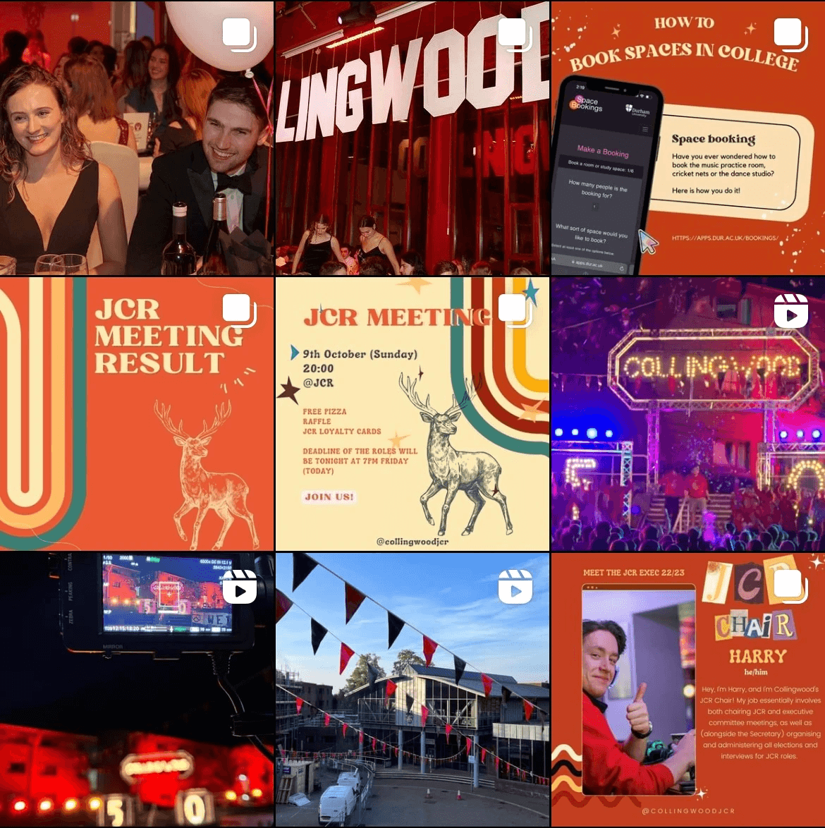
Explore this page to discover a meticulously curated collection of Instagram content, each post thoughtfully crafted with a tailored aesthetic that intricately designed to represent the brand. This strategic approach breathes life into the content, fostering a genuine connection with the audience.

Short extract from the YouTube Video "Things you should know before coming to Collingwood"
Short extract from the YouTube Video "Things you should know before coming to Collingwood"
Short extract from the YouTube Video "Things you should know before coming to Collingwood"
Originally tailored for YouTube, this fast-paced, attention-grabbing edit perfectly transitions into an engaging Instagram reel. Instagram Reels, with their swift and scroll-friendly format, offers an easier way to capture the audience's attention, be it through a quick swipe or landing on the For You Page on platforms such as Instagram and TikTok.
This not only caters to those unfamiliar with the full YouTube video but also serves perfectly as a standalone introduction to college facilities for incoming students.

Instagram Rebranding #1
Instagram Rebranding #1
Instagram Rebranding #1
Embarking on the creative journey of crafting Collingwood College's Junior Common Room's (JCR) brand identity, I infused vibrant colours like red, yellow and orange into our content. These colours not only function as a distinctive tone of voice within each post but also play a pivotal role in defining our unique brand identity.
In the vibrant spirit of Collingwood, known for its energy, I took the initiative to move beyond the standard college colour of red. While red is common among other colleges, our use of various vibrant colours transcends a singular tone. This deliberate approach creates an image that is not only diverse but also inviting, breaking away from any potential intimidation linked to the colour red.
In contrast to the pre-COVID era, the Instagram account has undergone strategic expansion, now featuring more event photographs. This addition not only serves as a promotion encouraging students to participate in these events but also functions as a guide, aiding students in effortlessly accessing essential information. This shift towards a friendlier tone aims to foster a stronger bond between the JCR and its community, a particularly vital aspect in the post-COVID era.


Instagram Rebranding #2
Instagram Rebranding #2
Instagram Rebranding #2
In the challenging time shaped by the COVID-19 pandemic, the executives of the Durham Ice Skating Society initiated a series of action to redefine our image and enhance engagement. While some executives focused on event logistics, ensuring flawless execution, I took responsibility for transforming our social media presence into a chic and elegant showcase.
Drawing inspiration from the inherent sophistication in ice skating, I curated a distinctive tone of voice through a thoughtfully chosen dark blue colour scheme. This deliberate selection went beyond aesthetics; it was a strategic move to project the common impression of elegance associated with ice skating onto our society's ice skating sessions. This aim was to attract both skaters and non-skaters to give this activity a try.
The deep, elegant hue served as a visual beacon, signalling our audience that something exciting was about to happen whenever we shared content on our social media platforms. The limited capacities for each event heightened anticipation, making our posts eagerly awaited.
This branding experience exemplifies my proficiency in crafting a captivating online presence, demonstrating my skill in integrating thoughtful colour choices that aligns perfectly with the brand.
Ready to Work Together ?
Let's craft captivating stories together.
Get Athos Pro